

Before we left for vacation, I installed the public beta for iPadOS 26 on my iPad Pro and the macOS Tahoe public beta on my work-issued MacBook Air M2.
I've had a little time now with each and wanted to share how things have been going. This isn't in any particular order, just quick observations.
iPadOS 26
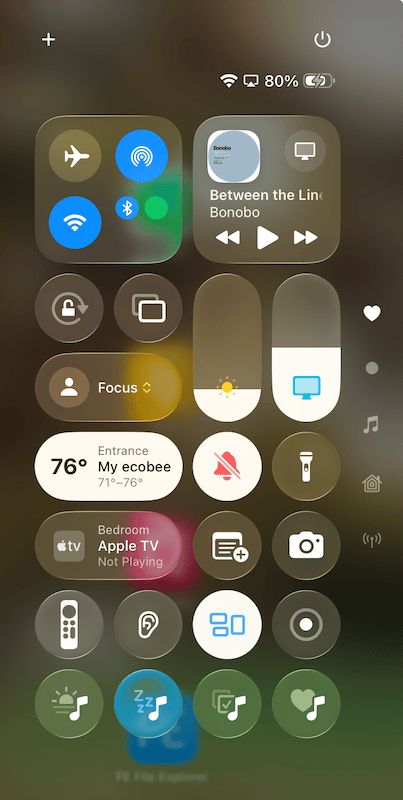
Liquid Glass, Apple's new design material it's implementing across all of its platforms, has been fine for me, and I mostly like it a lot. It still feels off in certain places, but I think Apple will figure it out.
The new windowing system is very good! It's definitely more powerful and Mac-like.
Using iPadOS 26 on my Studio Display is excellent! I have my apps and windows setup nearly identical to how I have them on my Mac.
I've had up to 11 apps open with windows all over the place, and it feels very natural. I haven't noticed any issues with sizing windows as I want. My iPad Pro did get sluggish at times with that many open, and I'm not sure if that's a beta-related issue, or if the iPad's resources were maxed out.
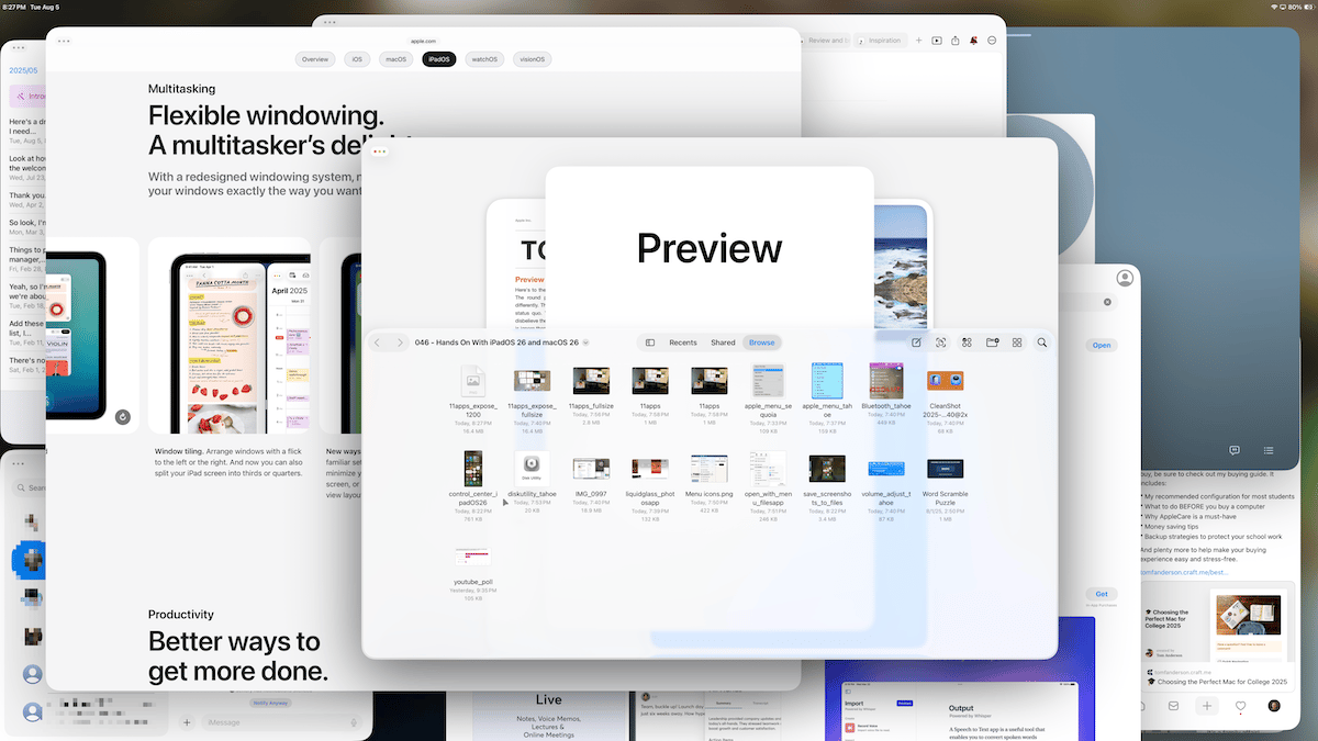
Slinging windows to the left and/or right side of the display will put the window in a 50% size in that area. When you slide an app to the top of the display, it goes full-screen. Of course, you can always use the green button in the window controls to change window shape and position.
In full screen apps, window controls jump from the upper left of the app's window to the menu bar next to the app's name.


Slide Over, the multitasking feature in previous versions of iPadOS that allows an app to hover in a narrow window over another app, and be dragged into and out of view along the edge of the display, no longer exists. I kind of miss it.
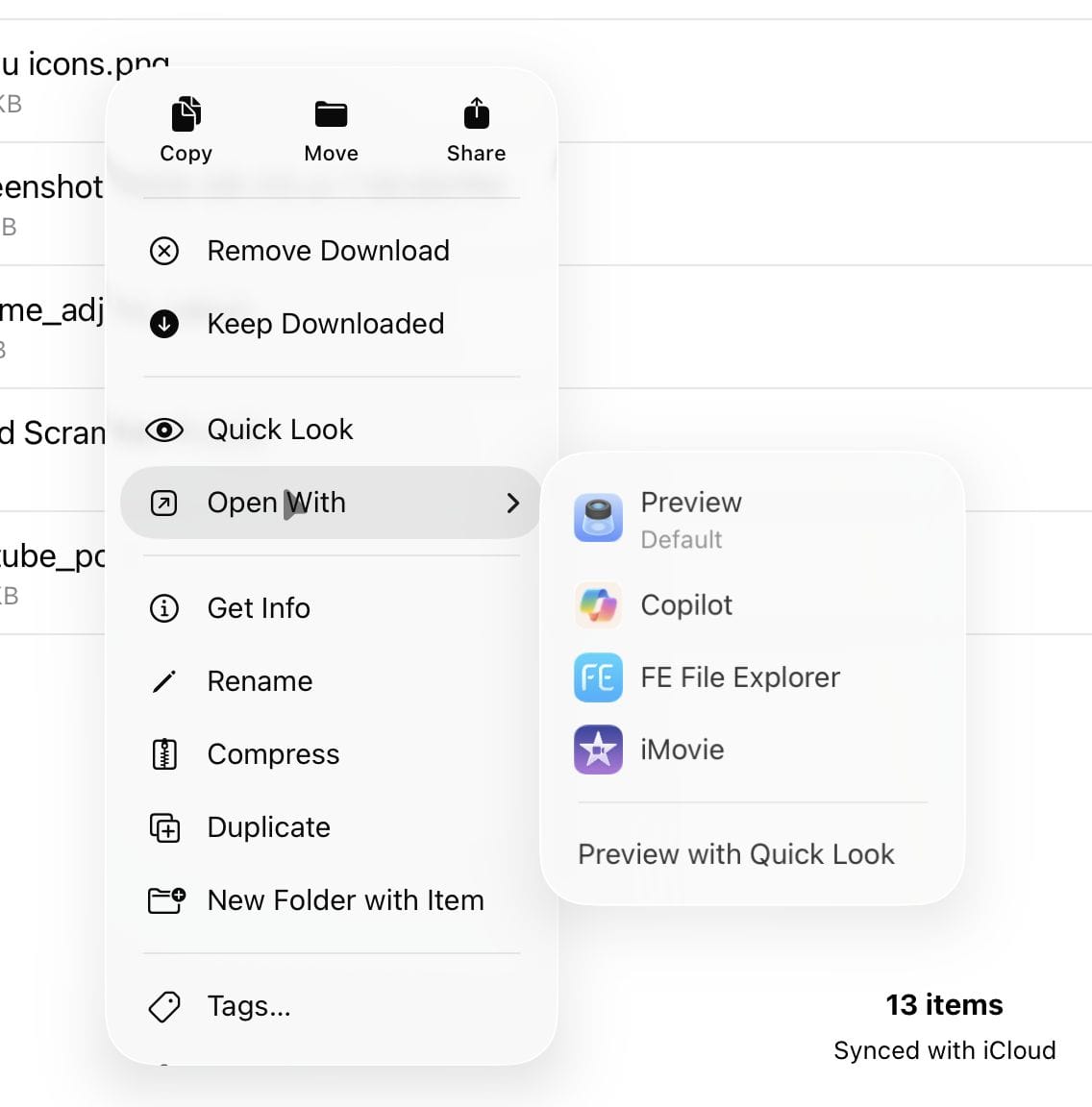
In the Files app, when using a mouse or trackpad, it's now a double-click to open a file. When using touch, it's a single tap as before. And "Open With" is available when right-clicking a file.
I wrote and edited this newsletter on my iPad, including making all image adjustments using the new Preview app, to get a feel for its capabilities with the new multitasking system. Overall, it held up well.
macOS Tahoe
I don't have as much to share yet for Tahoe, but here are a few things of note.
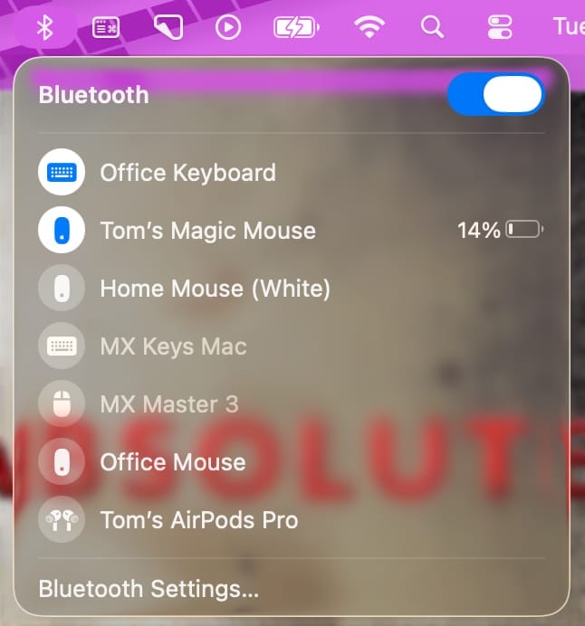
Liquid Glass is also on the Mac and here's an example of it in the Bluetooth menu. As you can see, its appearance is highly influenced by the colors of other UI elements.
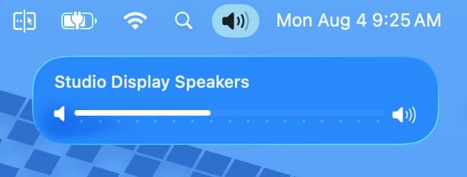
New volume adjuster window; it's no longer in the lower center of the display but just under the menu bar near Control Center.
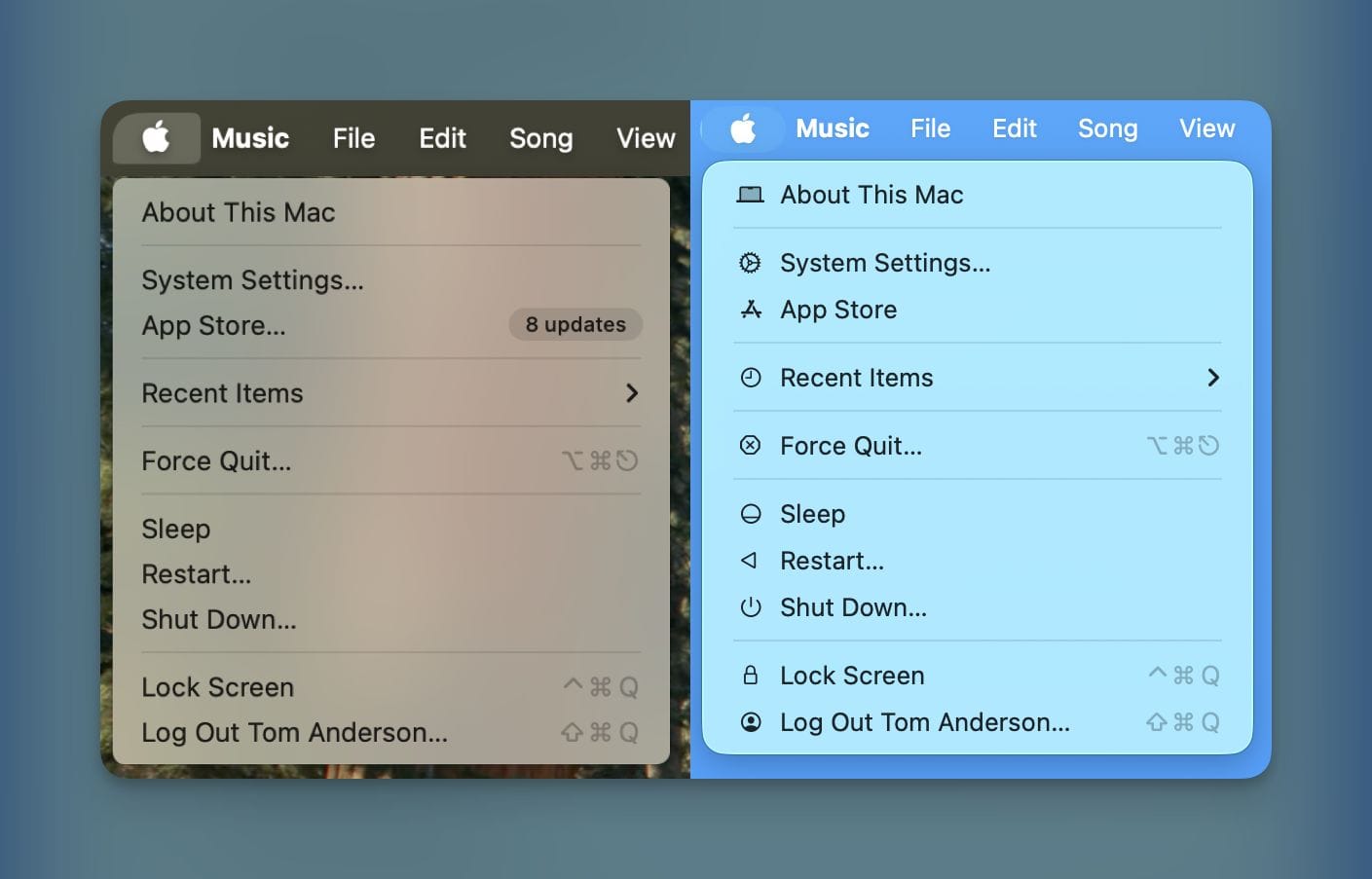
There are new icons in the menu bar drop-downs which looked a bit cluttered at first, but I'm used to them now. These are in iPadOS and iOS as well, but here's a comparison between macOS Sequoia and Tahoe.
Dialog boxes are left-aligned now instead of centered, and we have a new Trash icon.
Overall, both operating systems have been working well and I'll have more to say as we get closer to release date so look for that here and on Basic AF.